| Mn/DOT Traffic Data | |
|
|
|
| DataTools Index |
Data Plot
1. Detectors
2. Dates
3. Axis
4. Smoothing
5. Printing
6. Import/Export
7. Contour Plots
8. Time Lapses
Run DataPlot
1. Detectors
Data Plot has access to data from over 4000 traffic detectors. To plot a graph, you must know the index numbers for the detectors you are interested in. At this time, there is no online reference; it is recommended that you obtain a current All Detector Report for reference.![]() You
must select at least one detector to get DataPlot to make graphs. This
is done by entering the detector index number at the bottom of the window,
and pressing [Enter]. As many as ten individual detectors
may be plotted at one time, although if more than one detector is selected
then only one date may be plotted.
You
must select at least one detector to get DataPlot to make graphs. This
is done by entering the detector index number at the bottom of the window,
and pressing [Enter]. As many as ten individual detectors
may be plotted at one time, although if more than one detector is selected
then only one date may be plotted.
In addition to plotting individual detectors, Data Plot can also create
composite
detectors. A composite detector is a group of detectors which are averaged
together and plotted as a single line on the graph. To create a composite
detector, just enter two or more detector index numbers, with a space between
each. ![]() This
is useful for plotting mainline stations with multiple days.
This
is useful for plotting mainline stations with multiple days.
An advanced feature of composite detectors is the ability to include
ramp detectors in the composite. This is done by adding a plus "+" or minus
"-" before a detector index.![]() This has the effect of adding a ramp volume to the total before computing
the average volume. Ramp detectors have no effect on the occupancy, density,
or speed graphs. Note: all mainline detectors must be specified before
any ramp detectors, because after a "+" or "-", all detectors are treated
as ramp detectors.
This has the effect of adding a ramp volume to the total before computing
the average volume. Ramp detectors have no effect on the occupancy, density,
or speed graphs. Note: all mainline detectors must be specified before
any ramp detectors, because after a "+" or "-", all detectors are treated
as ramp detectors.
2. Dates
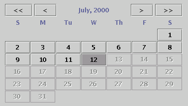 At
least one date must be selected in addition to at least one detector. This
is done using the date selection calendar in the lower left corner of the
window. When the program is first started, the current month will be visible
on the calendar. Each date on the calendar is a toggle button to select
that date for plotting. Dates which do not have data available will be
grayed out and cannot be selected. Up to ten different dates may be plotted
for one detector (or composite detector). If more than one detector has
been selected, then only one date may be selected.
At
least one date must be selected in addition to at least one detector. This
is done using the date selection calendar in the lower left corner of the
window. When the program is first started, the current month will be visible
on the calendar. Each date on the calendar is a toggle button to select
that date for plotting. Dates which do not have data available will be
grayed out and cannot be selected. Up to ten different dates may be plotted
for one detector (or composite detector). If more than one detector has
been selected, then only one date may be selected.
At the top of the date selection calendar, there are four buttons for selecting the month and year to be displayed. The "<<" and ">>" buttons select the previous and next years. The "<" and ">" buttons select the previous and next months.
3. Axis
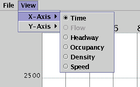 To
change the X and Y axis, select the View menu at the top of the window.
One X-axis and up to five Y-axes may be plotted on the graph at one
time. Either one may be set to any of Time, Flow, Headway, Occupancy, Density,
or Speed. Time is simply the time of day, ranging from midnight to midnight
of the selected date(s). Flow is the flow rate in vehicles per hour. Headway
is the spacing between vehicles, in seconds. Occupancy is a measurement
of the percent of time a detector is "occupied". Density is displayed as
the number of vehicles per mile. Speed is displayed in miles per hour.
Note: To compute density and speed, each detector must be assigned an
appropriate average field length. These values are still being
tweaked, so for now, density and speed may not be accurate for all detectors.
For a somewhat more detailed description of this stuff, look
here.
To
change the X and Y axis, select the View menu at the top of the window.
One X-axis and up to five Y-axes may be plotted on the graph at one
time. Either one may be set to any of Time, Flow, Headway, Occupancy, Density,
or Speed. Time is simply the time of day, ranging from midnight to midnight
of the selected date(s). Flow is the flow rate in vehicles per hour. Headway
is the spacing between vehicles, in seconds. Occupancy is a measurement
of the percent of time a detector is "occupied". Density is displayed as
the number of vehicles per mile. Speed is displayed in miles per hour.
Note: To compute density and speed, each detector must be assigned an
appropriate average field length. These values are still being
tweaked, so for now, density and speed may not be accurate for all detectors.
For a somewhat more detailed description of this stuff, look
here.
Once an axis has been selected, it is possible to "zoom in" on a smaller range of that axis. For a vertical axis, this is done by two buttons on the right side of the window, "+" and "-". The "+" button zooms in to a smaller range of values on the graph, and the "-" button zooms out to a larger range of values. Once zoomed in, the scroll bar next to those buttons may be used to select the actual range for the zoomed in view. There are also buttons and a scroll bar for controlling the horizontal axis just below the graph. They work in the same manner.
4. Smoothing
It is possible to see the points themselves, without lines connecting them. Simply right-click on the graph and de-select the "Connect points" check box that pops up.
5. Printing
Printing is very simple in Data Plot. First, set up the graph exactly the way you want it to be printed, and then select the "Print" item from the "File" menu. The "Page Setup" dialog will come up. Select the paper size, orientation and margins and press "OK". Now, the print dialog will pop up. Select the printer and press "OK".6. Import/Export
DataPlot is capable of importing and exporting data. To export data, simply create the graphs you want to export and choose "Export" from the "File" menu. If you are running DataPlot as a client, you will be prompted to allow access to your local file system. After granting access, you are presented with a dialog where you can enter the location and filename you wish to save the data under. Click save and that's it! DataPlot is not capable of exporting Composite detectors.To import data, choose "Import" from the "File" menu. Again, a client session of DataPlot will prompt you for local file system access and after granting that access, you will be presented with an "Open" dialog. Browse to the proper location and select the appropriate file. Click "Open" and that's it!
A note about importing and exporting... exporting will overwrite (not append) files. Importing requires the file to be in very specific layout. Although the file is simple ascii text format, it is recommended that you don't edit these files.
7. Contour Plots
Data Plot is capable of displaying contour plots of the roadway. To access the plot, choose the tab at the top named "Contour Plot". Select the desired dates with the calendar and one section of a corridor with the drop down menus. Once you click 'OK', Data Plot will create the contour plots and display them in the window. This may take a couple minutes depending on the number of dates and the length of the roadway.
The plots will appear in several tabs for various measures, dates, and aggregations. To traverse these tabs either click the tab you want to see or scroll through them.
The x-axis is time of day, shown by vertical black lines at each 3-hour mark. The y-axis shows each station with enough (>95% complete) data in the selected section of the corridor. The plot is colored depending on the data set being examined.
Some plots, like some speed plots, do not always have enough detail to get a
good picture of the roadway. To help make things clearer, a slider is included
to adjust where the "center" of the data lies, as a fraction of the maximum
value. This will be colored yellow in most plots (capacity plots color
0 vehicles/hour white; this cannot be adjusted, despite the presence of a slider). The color scale is made of two linear functions: one from the
minimum to the "center", and one from the "center" to the maximum. After
changing the slider, select File > Refresh or press
F5 to update the plot.
The menu bar at the top contains many useful tools for modifying the plots:
- File lets you save the plot, select which tabs to show, refresh the current tab, or view a time lapse of the plot.
- Gradient lets you select which type of gradient to
format the plot in:
- No Gradient (default): A pseudo-nearest-neighbor interpolation. This colors each rectangular cell according to the top-left data point.
- Bilinear Gradient: A bilinear interpolation. This smooths the plot out along both axes, using a linear function in both directions.
- Bicubic Gradient: A bicubic interpolation.
This smooths the plot out along both axes, using differential splines to
smooth the data and remove the edges that can appear in a
bilinear interpolation. Data Plot uses a modified version of the
CachedBicubicInterpolatorfrom Paulinternet.
File > Refreshor pressF5to update the plot. - Smoothing (mins) lets you change the width of each cell in minutes.
- Width and Height let you change the precise size of the window.
- Time Lapse Length (seconds) lets you change the amount of time the time lapse lasts.
8. Time Lapses
From within the contour plot, you can create a time lapse. A time lapse is an animation in which you can view the corridor throughout the day in a matter of seconds. The x-axis shows the stations on the selected section of the corridor, and the y-axis shows the relative values of the data set. The animation lasts as long as specified in the Time Lapse Length textbox. The time lapse uses whatever gradient is currently displayed on the contour plot.